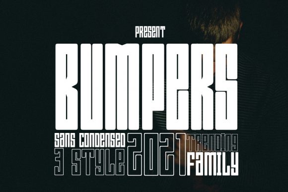
Bumpers: A Bold Display Font for Modern Web Design
As a web designer who builds landing pages, SaaS dashboards, and e-commerce experiences, I choose fonts not just for aesthetics—but for behavior. How does a typeface guide the eye? Does it reinforce brand confidence or dilute clarity? That’s why Bumpers stands out: it’s a tightly crafted display font built for impact without sacrificing digital legibility.
Bumpers has a distinct futuristic rhythm—geometric yet expressive, with sharp angles, balanced proportions, and subtle optical tweaks that hold up across devices. It’s not overly technical or cold; instead, it carries energy and intention. The letterforms are confident but not aggressive, making it ideal for brands that want to signal innovation, creativity, or premium positioning—without leaning into sci-fi clichés.
Where Bumpers Earns Its Place on Screen
In real-world web layouts, Bumpers excels where attention must be directed and tone must be set instantly. Think hero section headlines, product name treatments, course title banners, or CTA buttons on high-conversion landing pages. Because it’s a display font, its strength lies in short, high-impact text—not long paragraphs. Using it for body copy would compromise readability and accessibility, but deployed intentionally, it becomes a powerful visual anchor.
For example: on a boutique online store selling sustainable home goods, pairing Bumpers with a clean, neutral sans serif like Inter or Manrope creates immediate contrast—“Rooted” (in Bumpers) over a soft lifestyle image, followed by descriptive body text in the supporting font. That hierarchy tells users what matters first—and makes the brand feel both grounded and forward-thinking.
It works equally well for digital products. A no-code tool’s homepage might use Bumpers for its headline (“Build Faster. No Code.”), then switch to a lighter weight of the same family—or a complementary sans—for feature bullets. The result? A cohesive, scalable typographic system that feels intentional, not decorative.
Readability & Responsiveness: Practical Considerations
Display fonts can falter on mobile if not tested. With Bumpers, I recommend using it at 32px minimum on desktop hero headers—and scaling carefully down to 24–28px on tablet, 20–22px on mobile. Avoid going smaller than 18px, especially on buttons or overlays. On dark backgrounds, ensure sufficient letter spacing (tracking) and contrast—Bumpers’ strong stroke contrast helps here, but always verify against WCAG guidelines.
When layered over imagery, add a subtle text shadow or background scrim. Its clean geometry holds up better than script or handwritten fonts under opacity or blur, making it reliable for hero banners, social ad creatives, or email header graphics.
Pairing Bumpers Thoughtfully
Like any strong display font, Bumpers thrives when paired with purpose. My go-to pairings:
- Sans serif companions: Inter, Poppins, or Work Sans for UI text, navigation, and paragraph content—clean, accessible, and highly legible.
- Serif accents: For editorial sites or creative agencies, try Bumpers with Lora or Playfair Display in headings—adding warmth and authority without competing.
- Avoid pairing with other display or script fonts. Two bold personalities clash. Keep supporting typography quiet so Bumpers leads.
Also check what’s included: most premium display font licenses for Bumpers offer multiple weights (Light, Regular, Bold), true italics, OpenType features like stylistic alternates, and extended Latin character support. If your audience includes multilingual users, confirm coverage for accented characters and diacritics—especially for European or Latin American markets.
Licensing for Real Digital Projects
Always verify the license before embedding Bumpers into a live site. Most reputable vendors offer web font licenses covering unlimited pageviews, custom domains, and commercial use—including client work, SaaS platforms, online stores, and digital templates. Avoid free “download” sites that lack proper licensing—they risk legal exposure and often deliver outdated or incomplete files.
If you’re building a brand kit for a client, include Bumpers in their design system documentation with usage rules: “Use only for primary headlines and logo lockups. Never for body copy or data tables.” That kind of clarity prevents misuse and preserves brand consistency across web, email, and social assets.
When to Reach for Bumpers—And When Not To
Reach for Bumpers when you need:
- A distinctive hero headline that communicates modernity and confidence.
- A visual signature for a portfolio site, creative agency, or digital course platform.
- Branded section dividers or callout boxes that need personality without clutter.
- Logo wordmarks where scalability and screen-friendliness matter.
Pause before using it for:
- Navigation labels or small UI elements (too dense at small sizes).
- Form fields, error messages, or system notifications (prioritize function over flair).
- Long-form blog posts or documentation (choose a proven reading font instead).
In practice, I’ve used Bumpers successfully on coaching websites (to convey clarity and transformation), product launch pages (for urgency and distinction), and even as a subtle accent in dashboard empty states—where a single bold word like “Ready” sets tone without overwhelming.
At its core, Bumpers isn’t about being loud—it’s about being clear. In an ecosystem crowded with generic sans serifs and overused display fonts, it offers a rare combination: strong identity, digital resilience, and thoughtful craftsmanship. That’s why it stays in my active font library—not as a novelty, but as a reliable tool for shaping how users perceive, navigate, and trust a digital experience.