Hoombie: A Playful Display Font for Modern Web Design
As a UI designer who ships dozens of landing pages, SaaS dashboards, and e-commerce experiences each year, I pay close attention to how typefaces shape first impressions, guide scanning behavior, and reinforce brand voice—without slowing down the page or compromising readability. Hoombie stands out in my font library not because it’s flashy, but because it’s intentionally expressive: a display font that balances charm with clarity, uniqueness with usability.
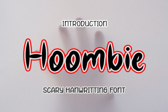
Hoombie is a hand-crafted display font with soft, rounded terminals, subtle irregularities, and gentle contrast between thick and thin strokes. It feels organic—not rigidly geometric, not overly scripted—but warm, approachable, and quietly confident. Its letterforms breathe naturally on screen, avoiding the artificial tightness common in over-optimized web fonts. That natural rhythm translates directly into better visual hierarchy: when you drop Hoombie into a hero headline or product banner, users don’t just read the words—they pause, register tone, and associate it with your brand’s personality before scrolling further.
Where Hoombie Earns Its Place in Digital Layouts
Hoombie isn’t built for paragraphs. It’s built for moments of emphasis—and those moments matter more than ever in fast-scrolling digital environments. Use it where attention needs to land:
- Hero section headlines on portfolio sites or creative agency landing pages—especially when paired with ample whitespace and a clean sans serif body font like Inter or Manrope;
- Call-to-action buttons on course sales pages or newsletter signups, where its friendly weight encourages clicks without shouting;
- Shop banners and product name tags for boutique online stores selling handmade goods, wellness products, or lifestyle brands—its warmth builds trust faster than sterile sans serifs;
- Section headers in blog layouts or editorial-style SaaS feature pages, where it adds visual punctuation without disrupting reading flow;
- Logo lockups and brand kits, particularly for coaching, creative education, or community-driven digital products that prioritize authenticity over corporate polish.
On mobile, Hoombie performs best at 28px and up for headings—and always with sufficient line-height (1.3–1.4) and letter-spacing (+0.5px helps legibility on small screens). Avoid using it below 20px or as body copy. For dark backgrounds, increase contrast slightly with a crisp white or light cream; over image overlays, add a subtle text shadow or semi-transparent background bar to ensure readability.
Pairing Hoombie Thoughtfully for Web Clarity
A strong display font like Hoombie shines brightest when supported by intentional pairing. In nearly every project I use it, I pair Hoombie with a highly legible, neutral sans serif for body text—Inter, Poppins, or even system fonts like -apple-system for performance-critical sites. This combination delivers both personality and practicality: Hoombie sets the tone; the sans serif carries the message.
For editorial or luxury-leaning digital experiences—think premium newsletters, design-focused blogs, or creative studio sites—I’ve successfully paired Hoombie with a restrained serif like Lora or Crimson Pro. The contrast between Hoombie’s soft playfulness and the serif’s quiet authority creates depth without visual noise.
Importantly, Hoombie includes stylistic alternates and multiple weights (Light, Regular, Bold), giving designers flexibility across contexts. It supports Latin-based languages and ships in WOFF2 format—ideal for fast-loading webfont implementations via @font-face or modern font hosting platforms. Always verify multilingual support if your audience spans non-English markets.
Readability, Rhythm, and Real-World Trust Signals
Typography influences perceived credibility more than most designers admit. A poorly chosen display font can unintentionally signal “amateur” or “unpolished”—even with flawless code and beautiful imagery. Hoombie avoids that pitfall: its craftsmanship reads as intentional, not arbitrary. Its consistent x-height and open counters improve scanning speed on landing pages, especially for short benefit-driven headlines (“Grow Your Confidence,” “Launch With Joy,” “Design With Heart”).
In conversion-focused layouts, I’ve seen Hoombie lift engagement metrics—not because it’s “trendy,” but because it aligns tone with audience expectation. A mindfulness app using Hoombie in its hero headline feels more human and grounded than one using a rigid tech sans serif. A children’s learning platform gains instant warmth without sacrificing clarity. And for solopreneurs launching digital courses? Hoombie signals creativity and care—qualities learners actively seek.
Licensing and Practical Implementation
Hoombie is a commercial font, and its licensing covers web use—including live websites, client projects, online stores, digital templates, and downloadable brand assets. Always confirm the license includes unlimited domains and production use, especially if deploying across multiple client sites or white-labeled SaaS interfaces. Self-hosting via WOFF2 ensures full control over loading behavior and eliminates third-party dependencies.
When integrating Hoombie into a design system, treat it as a strategic asset—not just decoration. Define clear usage rules: “Hoombie = H1 and primary CTA only,” or “Hoombie + Inter = approved pairing for all marketing-facing pages.” Consistency reinforces brand recognition across touchpoints, from email headers to social media graphics to in-app modals.
Ultimately, Hoombie works because it respects the user’s time while honoring the designer’s intent. It doesn’t demand attention—it earns it. In an ecosystem saturated with generic fonts and algorithmically optimized type, choosing Hoombie is a quiet act of intentionality—one that pays off in clearer communication, stronger identity, and more meaningful digital experiences.